

- Branding
- Strategy
- Visual Identity
The regional rail authority needed to increase brand awareness, clarify their offering, and drive meaningful connection to riders in six counties across Southern California. When the pandemic drove ridership decreases, the agency also became a leader in regaining ridership efforts.
We did it together and we are the envy of other transportation agencies; I know, they’ve told us.
Monica Bouldin
Marketing Director - Metrolink

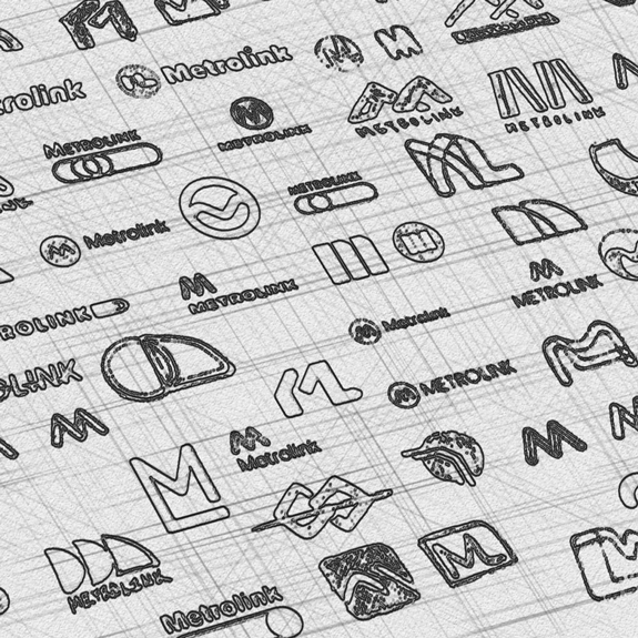
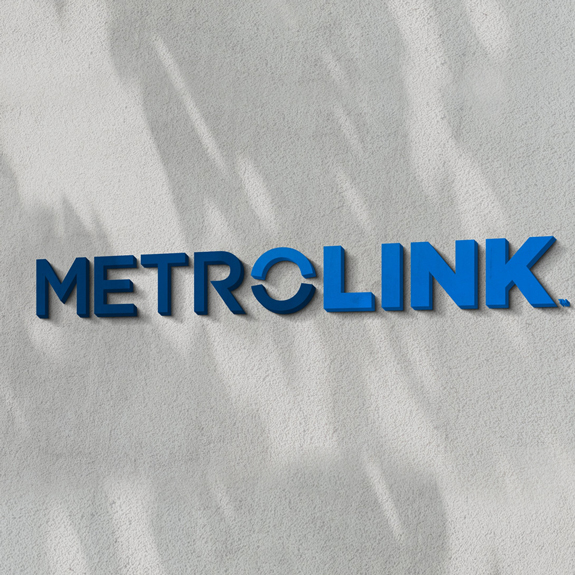
A refreshed visual identity
Alongside a thoughtful exploration and re-design of the Metrolink logo we also reimagined the brand’s typography, authentic lifestyle photography and signage and more to connect its community-driven legacy with today’s generation of modern riders.
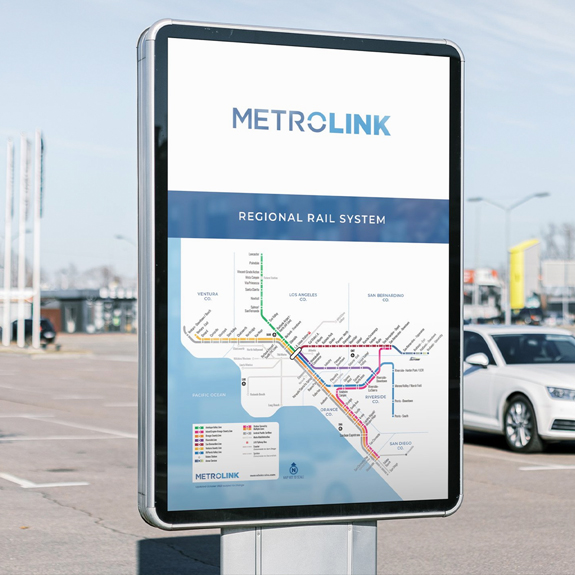
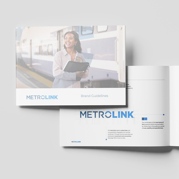
Connecting the dots
Utilizing the full breadth of the visual identity, Metrolink is set up for success with a comprehensive library of assets that support everything from brand presentations, way finding, social media marketing and beyond.

Want to see more?
Explore the full case study, campaign and more at the link below