

- Branding
- Naming
- Strategy
Sisters Janel and Shanel are trying to rebuild their failed banana pudding business, Nana Queens Puddery, but they've also failed to change with the times. Their brand and their truck were in desperate need of an overhaul. That’s why when we were was asked by OWN TV as a female-enterprise to be a part of their marketing and brand transformation, we knew it was an “Oprah-tunity a lifetime.
Branding is the human connection made when someone encounters your product. It is your handshake in a room or aisle when you are not there to introduce it. It should be crafted with care, smarts, and attention to all the delicious details it deserves.
Shannon Gabor
Clever Creative

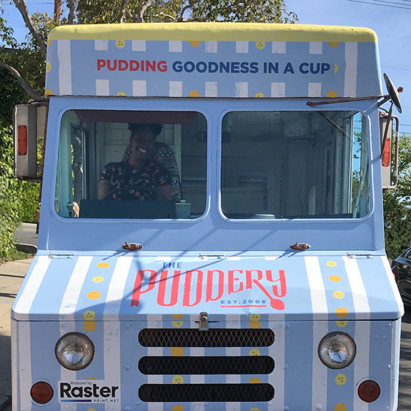
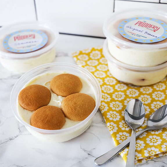
Goodness In A Cup
From name and logo to brand story and positioning, and especially the truck, Clever created a deliciously smart brand identity that elevated their product line, aligned to their price point, and supported their growth strategy for the future. It even made for a seriously heartwarming (dare we say tear jerking?) moment for all to see on TV.
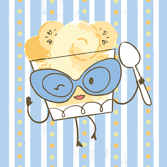
A Spoonful of Love
Keeping all of the joy and banana flavor from The Puddery’s original logo, we crafted a new identity and mascot that better represents their product and its lip-smacking goodness in its true form, instead of a simple ingredient play. The hand-illustrated character, Puddin’, was designed from the ground up so she can stand alone or be leveraged along side of the wordmark for better brand recognition.

We Love to Change Perceptions and Palates
A successful rebrand is like magic. It doesn’t matter how many years you’ve been going it, when you see the look on the client’s face after revealing their new brand, as if it was a rabbit being pulled from out from a hat, you can’t help but feel the very same magic they’re feeling.